In this project, we began with an in-depth immersion into the world of clinical psychology and neuropsychology, exploring not only the technical aspects of Ana Paula Machado's work but also the emotions, values, and goals she seeks to convey in her professional practice. The focus was on understanding how her brand relates to the people impacted by it — patients, families, and professional partners — and how this relationship could be visually translated into a strong and coherent identity.

The brand design process followed a strategic approach based on fundamental steps: research, defining brand values and attributes, and building the visual identity. We began with a research phase, where we conducted interviews with the client, analyzed competitors, and studied the needs of the target audience. This analysis allowed us to identify the core characteristics of Ana Paula's brand, such as trust, warmth, and professionalism.
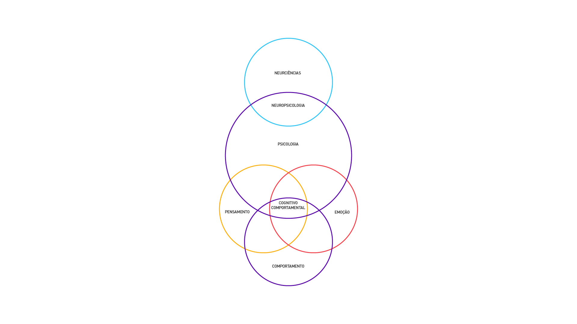
The goal was to achieve a positive and clear brand perception, highlighting Ana Paula Machado's extensive experience in neuropsychology, cognitive-behavioral therapy, and clinical care. We aimed to showcase her competitive differentiators, creating a brand that evolves alongside her professional growth and reflects the care she provides to her patients and their families throughout all stages of clinical support.
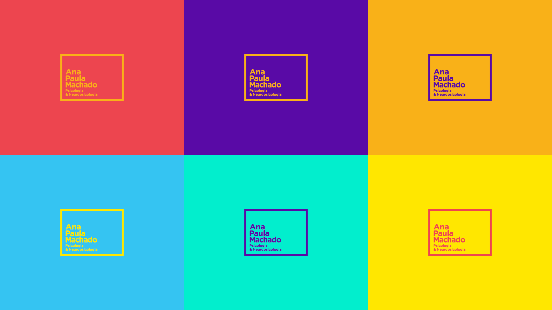
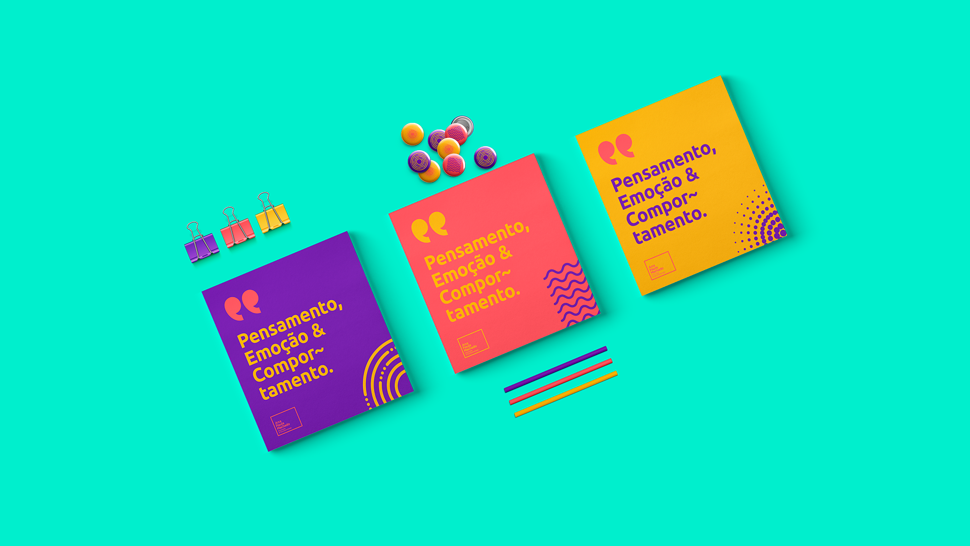
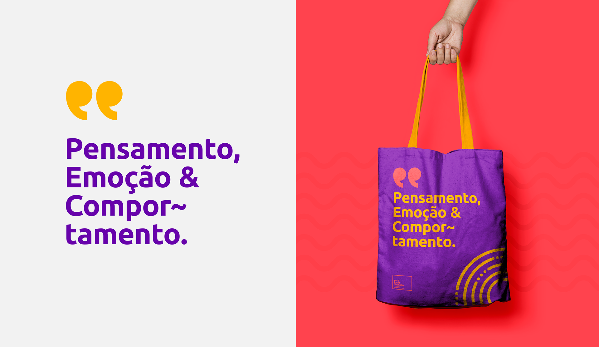
Based on the insights gathered, we defined the brand values and attributes, emphasizing the importance of creating a visual identity that was both welcoming and serious. The brand needed to be playful, yet without losing the maturity required for a psychologist. Flexibility was a key concept during development, allowing the visual identity to adapt to different contexts while maintaining consistency that reflected the nuances of the corporate world, but in the format of a personal brand.
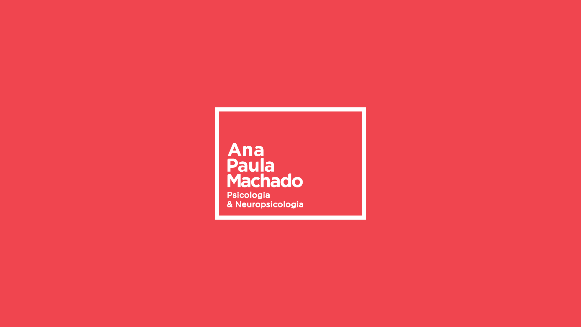
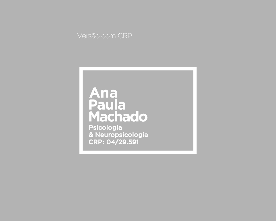
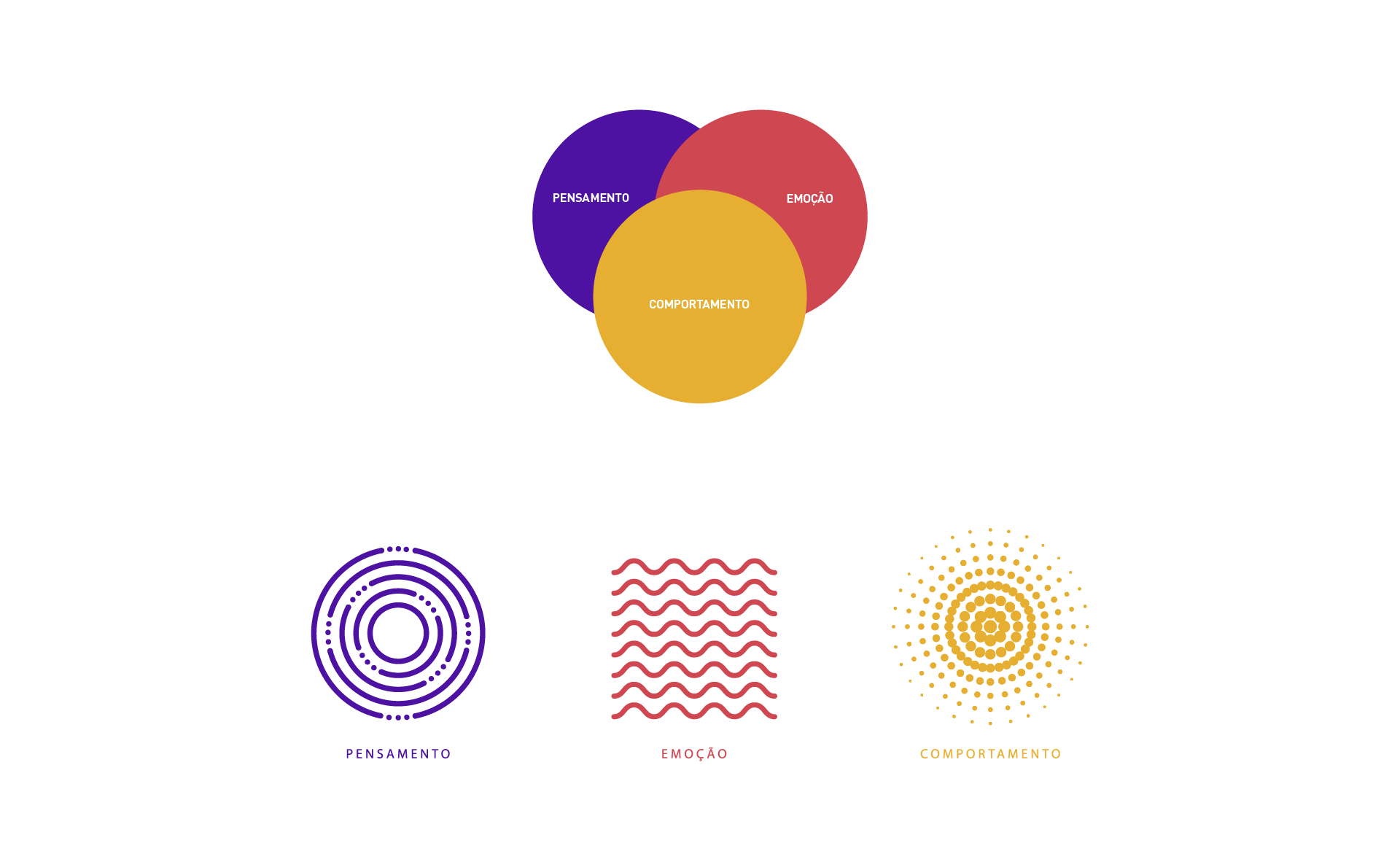
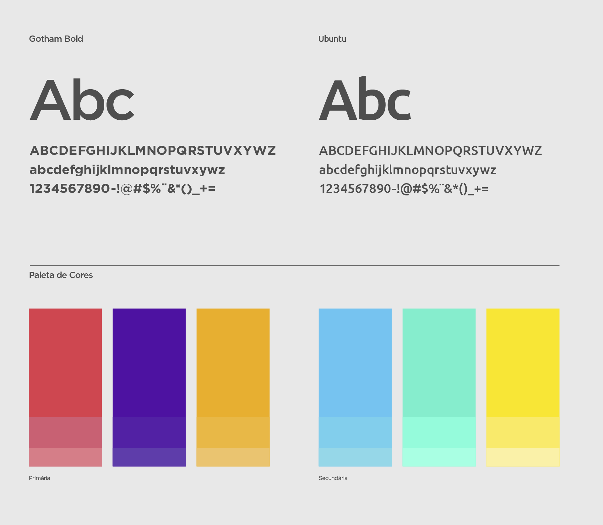
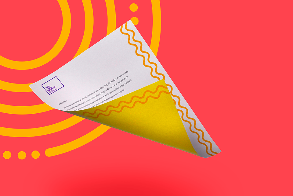
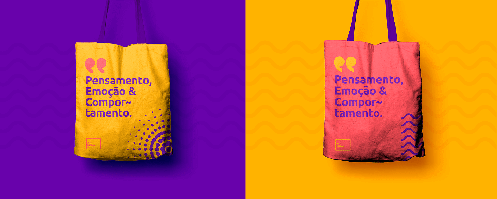
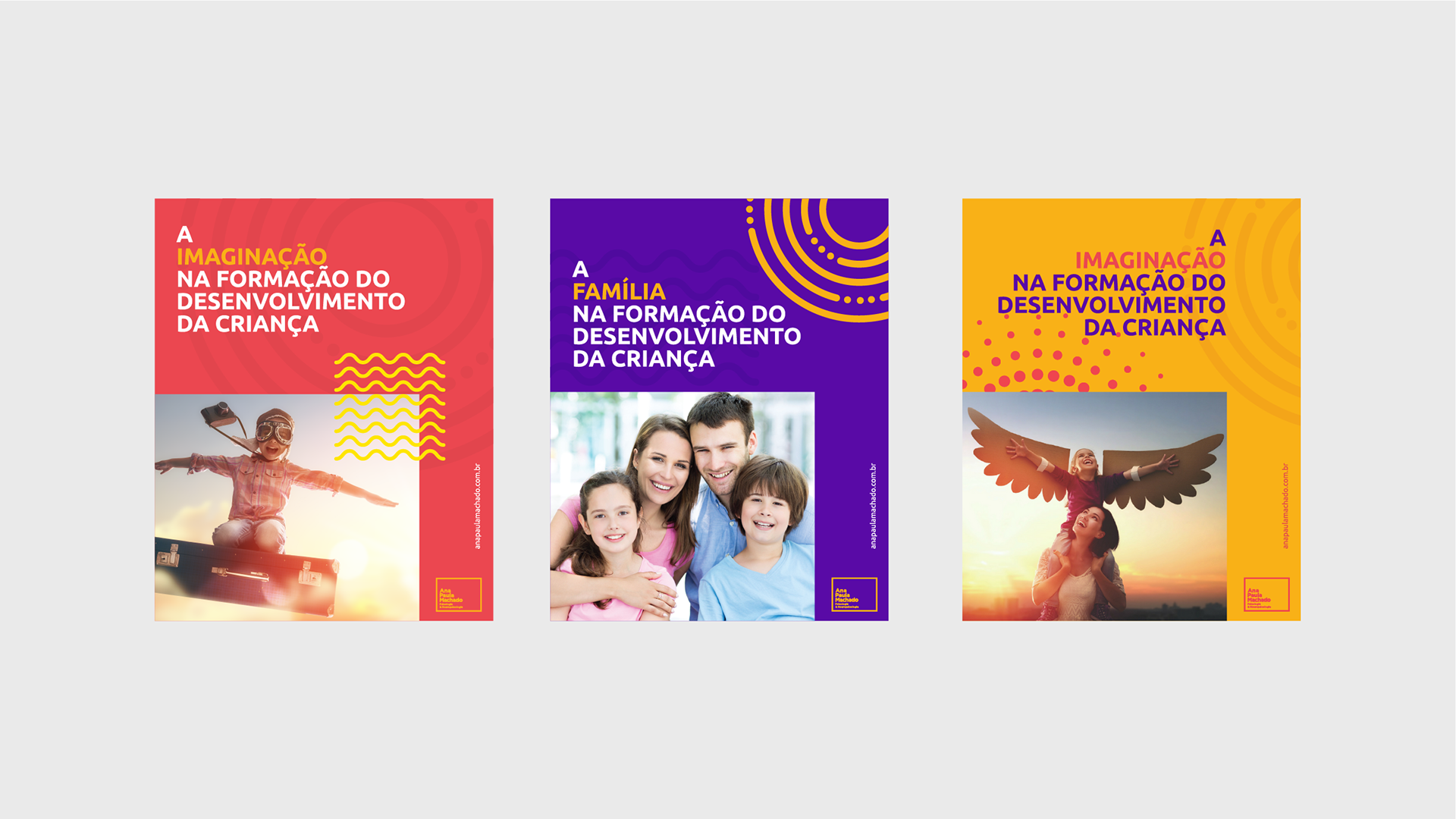
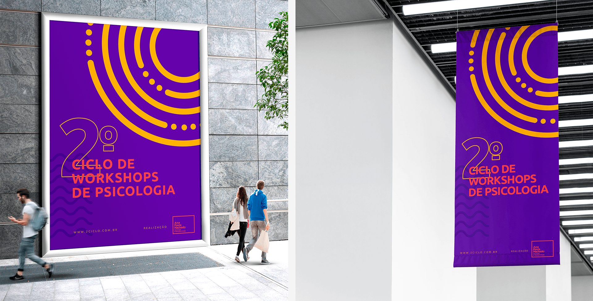
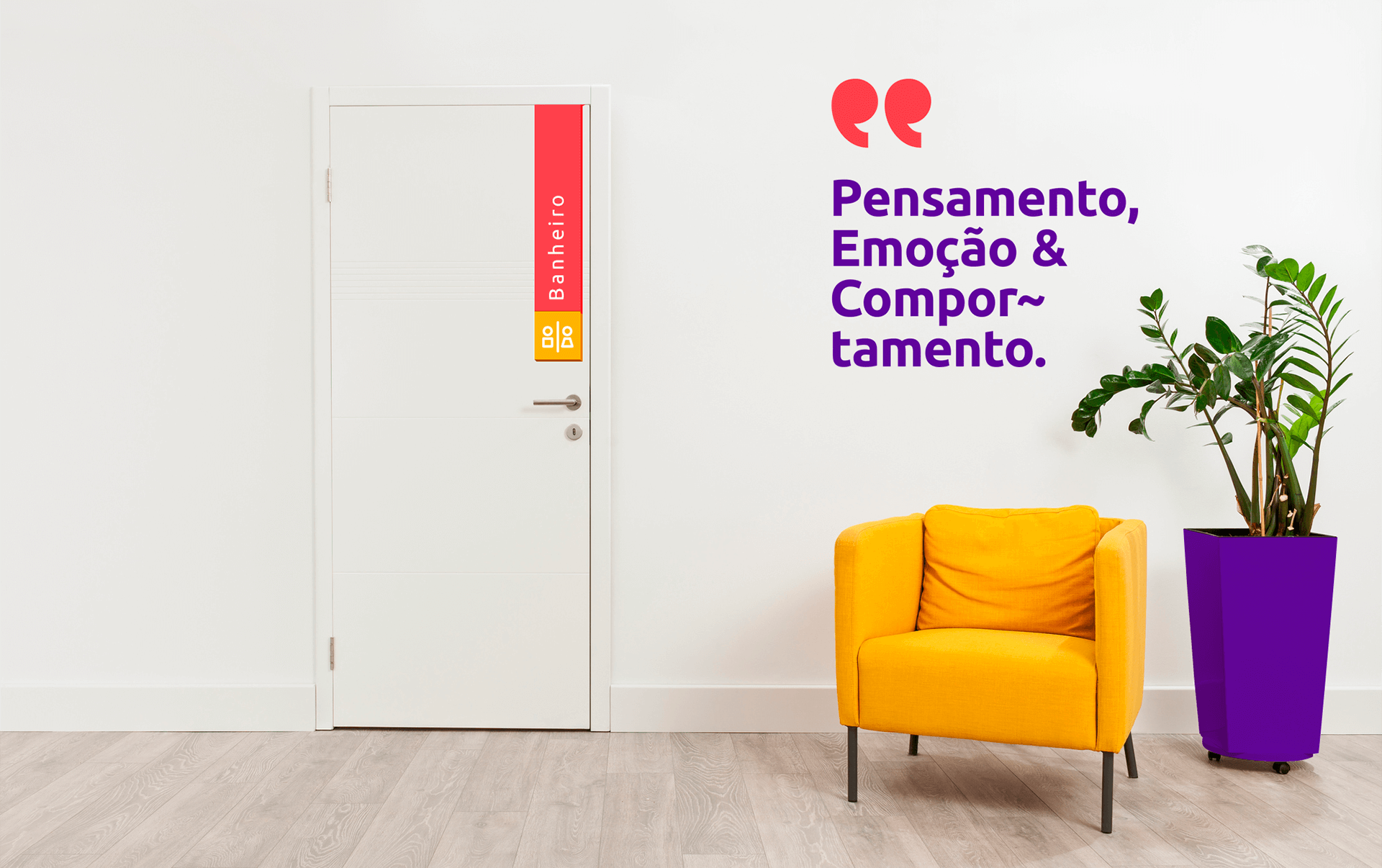
The next step was the creation of the visual identity system. During this phase, we designed elements such as the logo, color palette, typography, and other visual components that clearly and impactfully conveyed the essence of Ana Paula's brand. Every detail was carefully planned to ensure the brand was both modern and serious, balancing emotional and rational aspects.
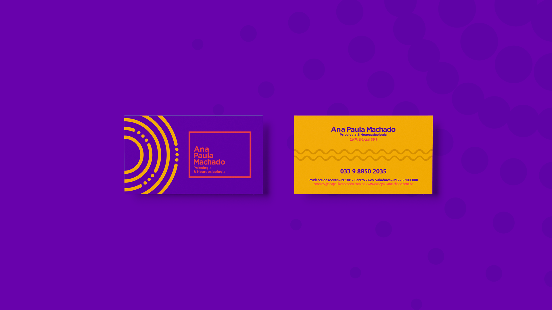
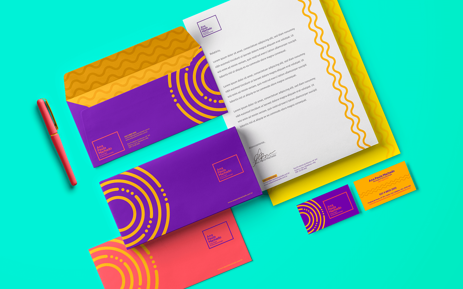
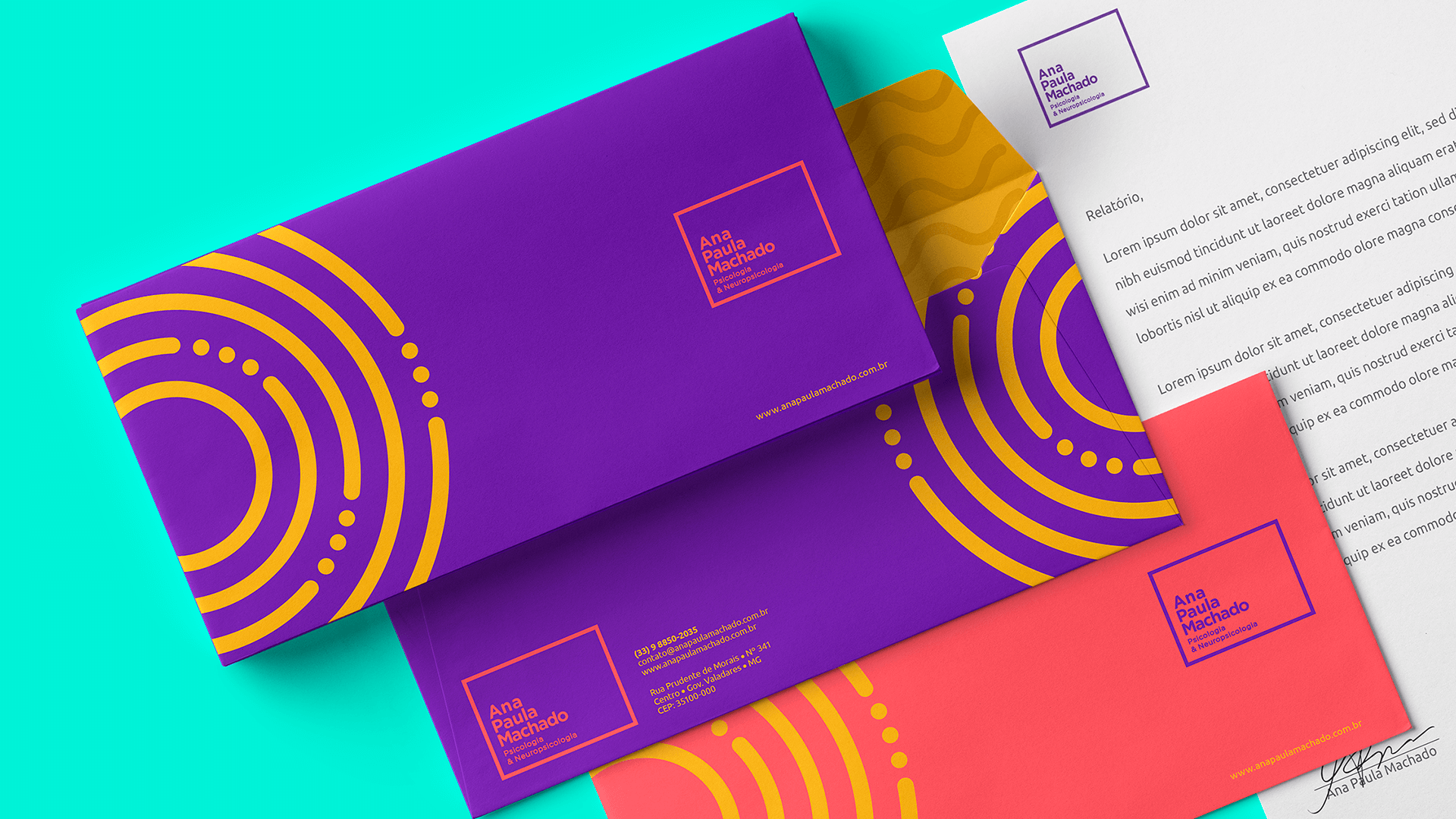
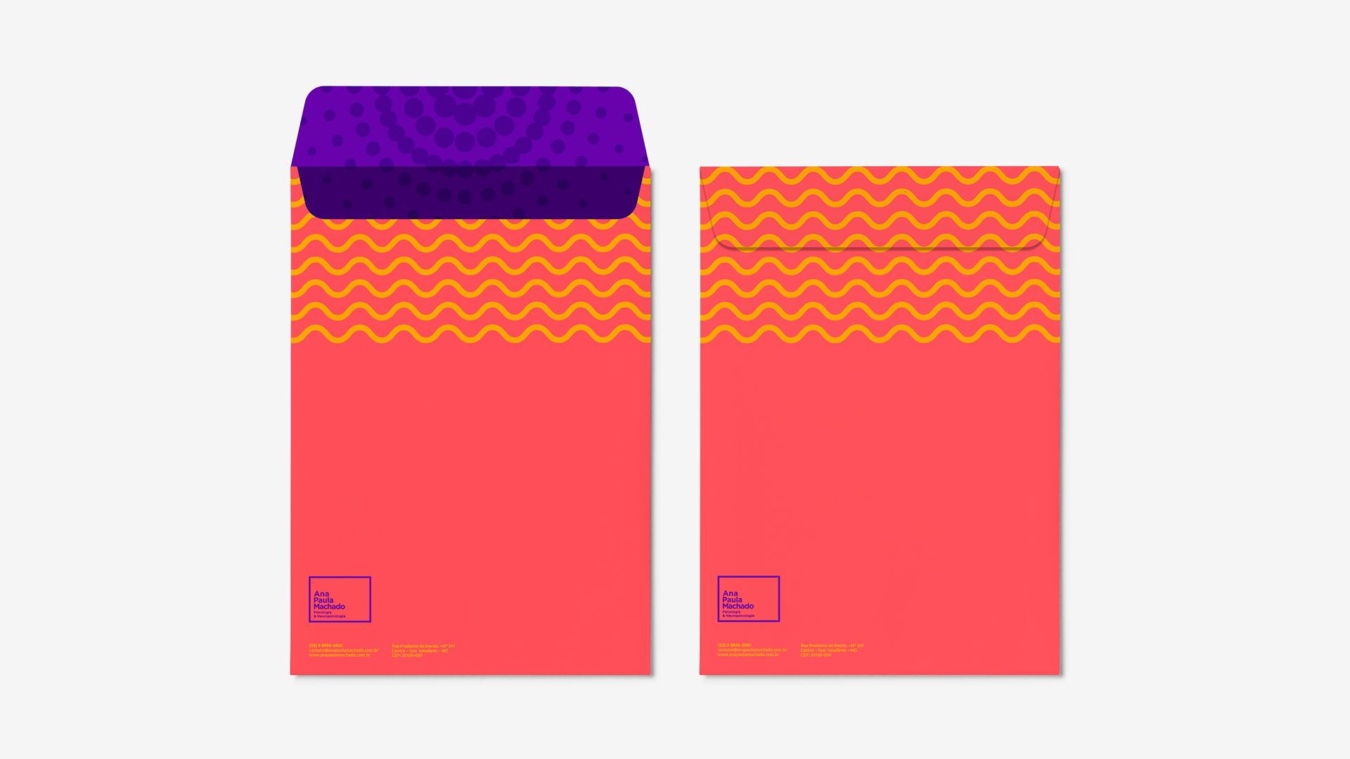
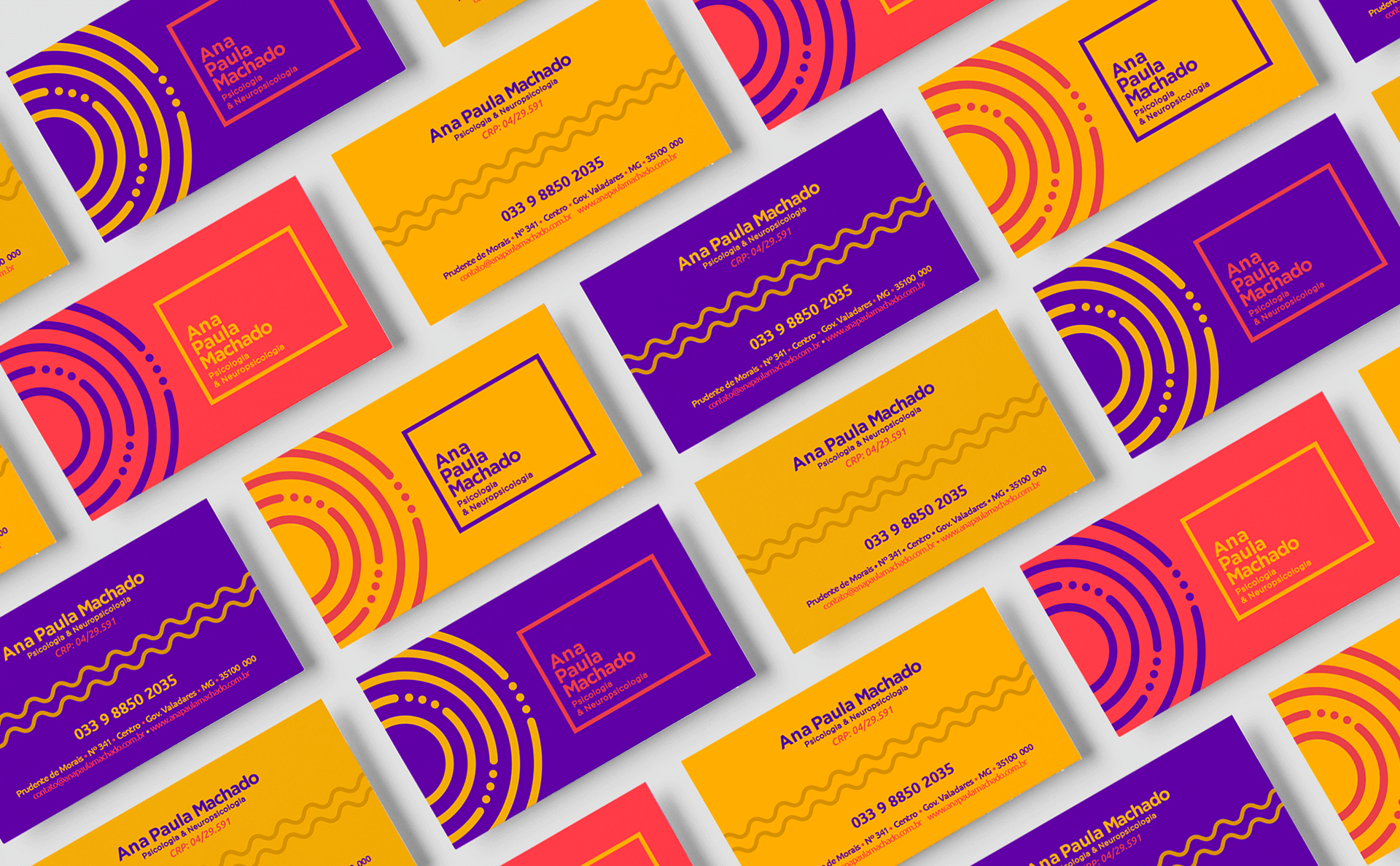
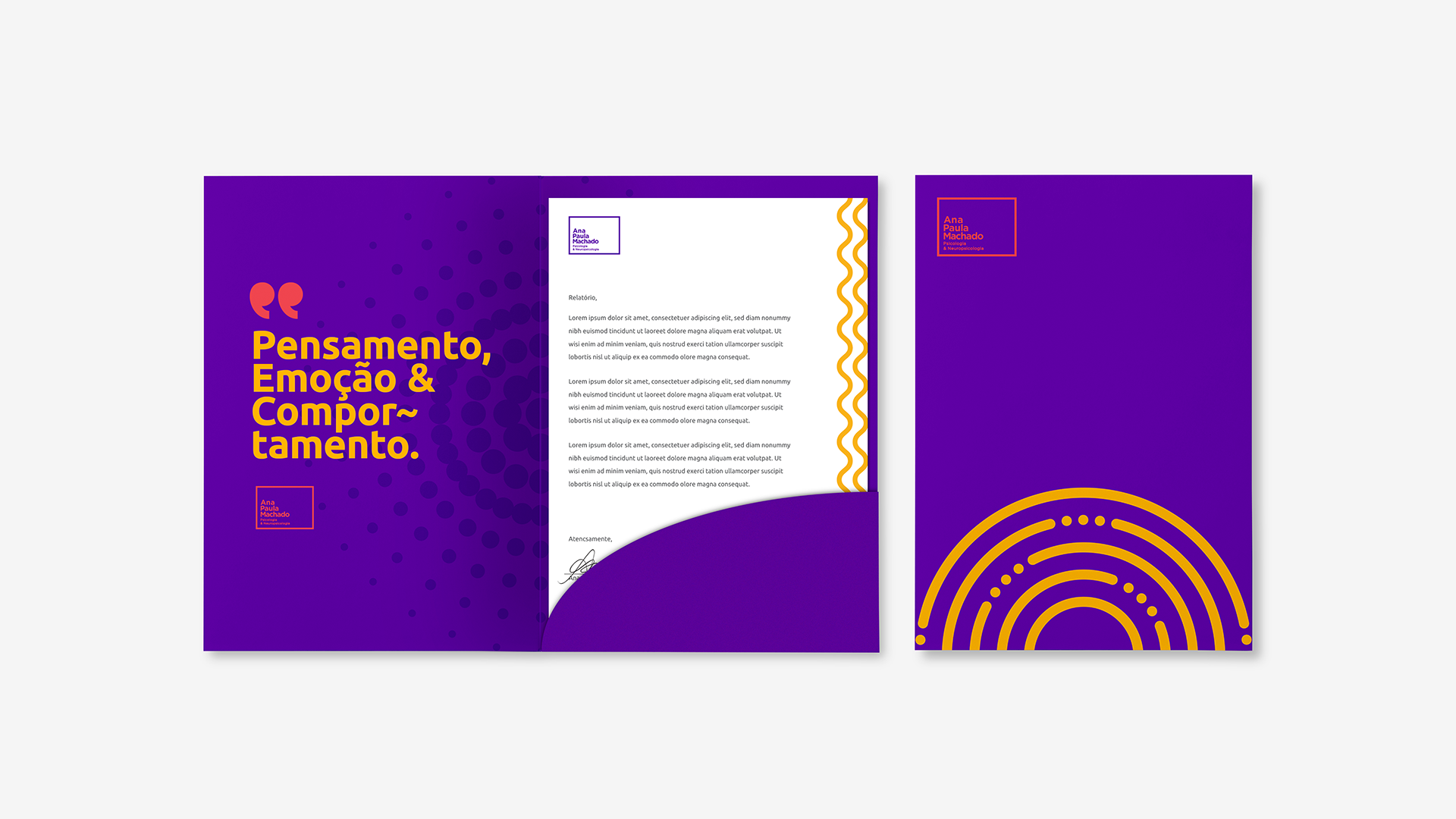
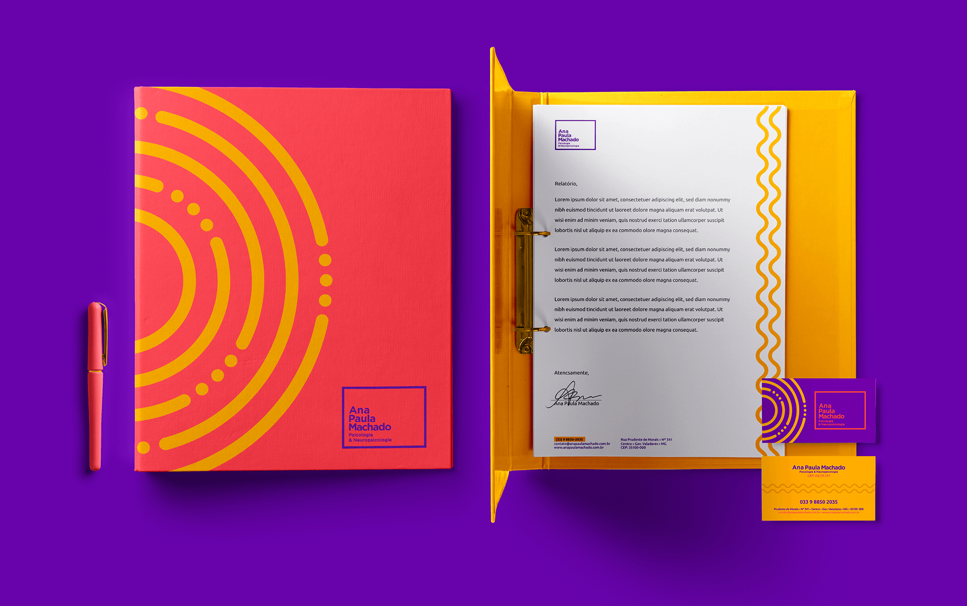
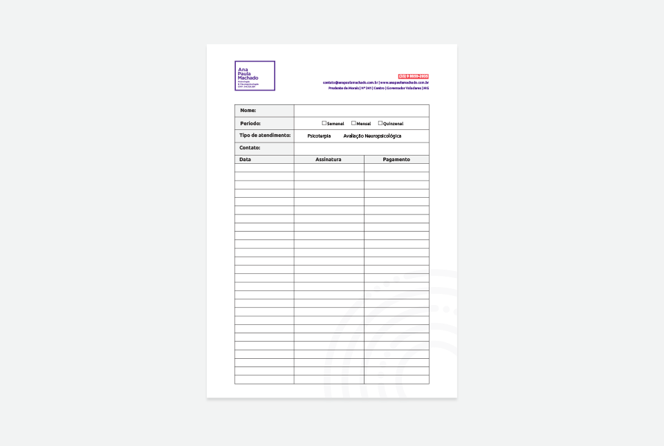
Furthermore, we focused on the application of the design across different touchpoints, ensuring the visual identity was cohesive across all materials and platforms, from business cards to the website and social media. We created guidelines for the brand's use, ensuring that its representation was consistent and faithful to all aspects of Ana Paula's work.
The final result was a solid and flexible visual identity that helps Ana Paula position herself authentically and reliably. The brand now reflects the trust and credibility essential in her field of work while maintaining a genuine and emotional connection with her audience. The visual identity system developed not only strengthens Ana Paula's presence in the market but also positions her as a leading professional in a field that requires high levels of trust and respect.